Amazon app critique and Redesign for FTUE — First Time User Experience
The main reason for me to take up this project was to get a practical insight into the UX design process by critiquing and redesigning a familiar app, which has a poor interface and UX, especially for the “FTUE”. Amazon app being widely used worldwide, seemed to be the perfect choice serving this purpose. The goal of this project was to identify common usability and accessibilty issues in the app and therefore provide an enjoyable, clutter-free shopping experience even for a first- time user. The expected outcome was a cleaner, minimal, user-friendly interface for the e-commerce app, Amazon.
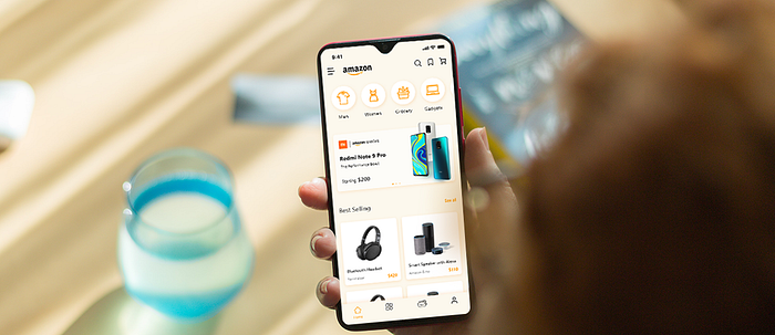
Project Timeline: March 2020 — May 2020
FYI: The screenshots and the comparisons drawn below are on the basis of the Amazon app as on March 2020. The interface and the features have updated and evolved over time. The case study is to demonstrate the thought process and not in any way challenging the talent, skills or capabilities of the highly intelligent team at Amazon. ☺️
Amazon — An Overview
It was the year 1994 when Bezos quit his job and launched Amazon in his garage. From being the inception of “online shopping” in 1995, when a book was ordered online for the first time, to being synonymous with online shopping — Amazon has grown to become the world’s largest online retailer. Its vision is “to be Earth’s most customer-centric company, where customers can find and discover anything they might want to buy online, and endeavors to offer its customers the lowest possible prices.”
Now, Amazon has broadened its portfolio to enlarge its customer base and meet their various requirements — from IMDb, Twitch to Alexa, Audible, kindle — the list goes on.
Now, let’s just consider the Amazon shopping app and website. Their target customer segment is located worldwide — from all walks of life — in both urban and rural geographies — with the average age of 37, split equally male and female. Its biggest competitors in the online and offline retail worlds include Chinese-owned Alibaba, Target, eBay and Walmart.
My personal experience
I’m an avid user of the Amazon shopping mobile app. (While the majority of shoppers prefer laptop/desktop). Infact I’m one among 150 million Amazon Prime subscribers. Mostly, I prefer Amazon while buying electronic products. However, the most popular category on Amazon is “Home and Kitchen”. I can often find products cheaper (better deals) on Amazon as compared to other platforms, in addition to exciting deals and cashbacks.
82% buyers agree that price is the leading factor of purchases on Amazon, (then shipping cost, product reviews) — Statistica.
Talking about the shopping experience, in a nutshell, I’m not a fan of the pre-purchase experience of browsing and placing an order, but I’ve never faced any issue with my orders (post-purchase experience). The delivery is always on-time, payments, cancellation and refunds are seamless compared to other competitors in India like Myntra and Flipkart. I’m just not pleased with the UI.
89% buyers agree that they are likely to trust Amazon over other e-commerce sites while placing an order (Feedvisor).
The motivation
Through my personal day-to-day online activities and interactions with people from all walks of life, I had realised that people with low tech- expertise simply keep guessing how to order an item on a real website, and most of them rely on help from their friends and family. With so many new features and technology being introduced every day, the complexity just keeps multiplying.

~77% of consumers purchase from brands they follow on social media.
~40% of U.S. internet users engage with voice assistants like Alexa or Google Assistant for shopping. (Future of Commerce)
~44% of consumers would rather communicate with chatbots (Humley)
This statistics point to the fact that people would rather chat or DM to place an order, than spending hours browsing or figuring out the complexities of a shopping app/ website. The friction experienced during one interaction with a digital platform can absolutely prevent a user from any further.
Moreover, I was most inspired by my parents’ and grand parents’ preference of buying things offline, rather than spending time on apps/ websites. The elderly users, with much lower digital literacy, are affected by common FTUE challenges such as decision fatigue, unclear navigation, and cognitive overload for new users.
The elderly audience represent a growing yet overlooked consumer segment with significant purchasing power and higher disposable income. Neglecting their needs leads to frustration, cart abandonment, and lost revenue for businesses. As the aging population expands globally, prioritizing accessibility and user-friendly design will not only enhance inclusivity but also unlock long-term market potential.
Defining the problem
How can we improve the first-time user experience (FTUE) on Amazon, ensuring that new users, especially the elderly can onboard smoothly and place an order without friction?
The “Re-design” process
At the beginning, it was mandatory for me to plan out the different steps to undertake, keeping in mind the Design thinking principles. The entire process was broadly split into two different stages.
- Current Design Analysis- Inspecting the current app for usabilty issues and elaborate User research
- Unsolicited Redesign-Suggestions for a better User Experience through a more intuitive User Interface
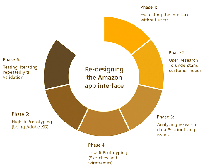
The process below briefs the iterative designing process followed by me. Scroll down to read about the entire case study.
Evaluating the Interface
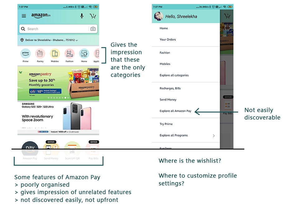
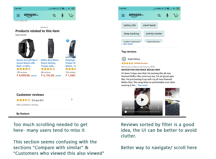
In this stage, I evaluated the Amazon app screens using the three methods: Informal Action Analysis, Cognitive Walkthrough and Heuristic Analysis. Following were my findings:
- Opening the app for the first time leads you to the signing in screen, however there’s an option to skip it all together. Also, an option to create an account.
- Amidst so much clutter, it is difficult to learn about the categories of products available.
- The search option is unreliable and doesn’t relate to product categories for easy searching.
- Filter options are clumsy, unorganised and not user-friendly. Many important and product-relevant filter options to aid in a better shopping experience could have been added.
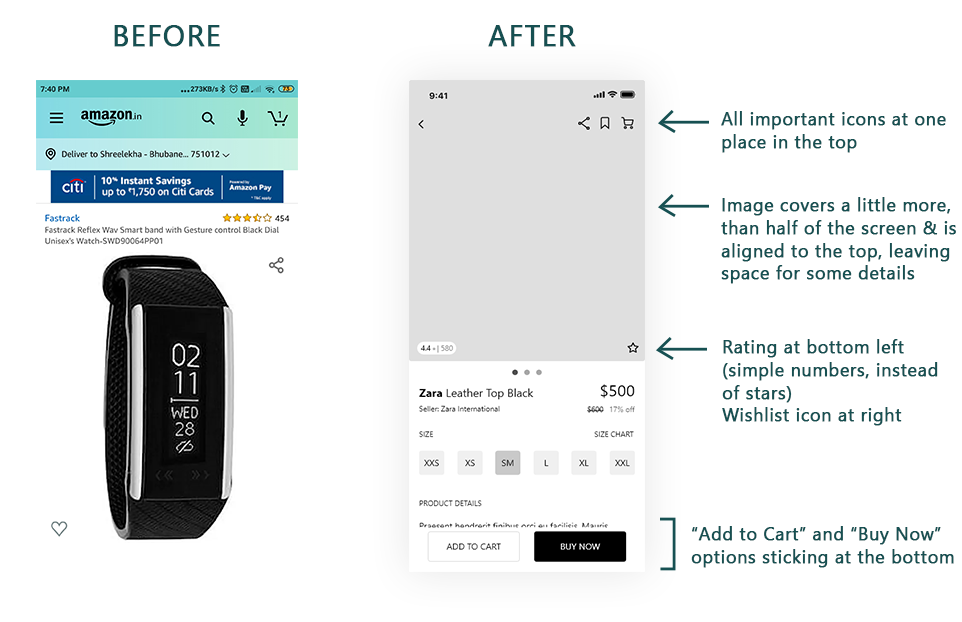
- While checking out a product, one can’t find the “Buy Now” or “Add to cart” options right on the screen. One needs to scroll down and find the buttons.
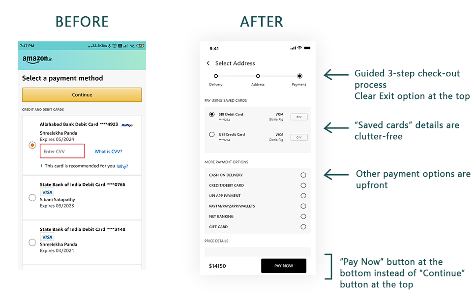
- Payment and address options are also poorly organised.
- Instead of “Swipe to place order”, a button to “confirm order” is better.
- Users should have freedom to cancel ordering go back in case they proceeded to place an order by mistake.




User Research
This is the most crucial step in the UX process. At the end of this, I expected to learn about the different groups of users, the goals they want to achieve through the app and also, to empathize with their pain points. It is impossible to learn about users without interacting with them, talking or meeting them. So, I carried out this process in the following phases.
Online Surveys-
In order to gather preliminary quantitative and qualitative data, it was important to gather as much data as possible. This couldn’t be possible by meeting people individually. Therefore, I carried out an online survey using Google Forms and forwarded it via mail and WhatsApp to a varied group of (50) users belonging to different walks of life. Following are some insights gained from the survey.

Interviews-
Apart from focussed preliminary data obtained via surveys, it was also important to interview few users, to collect elaborate data regarding the app. The five selected users were chosen such that they were well acquainted with the app and/or frequent users. They however belonged to different walks of life and different age groups.
The users were asked specific questions and also asked to walk me through the app and explain whatever issues they faced with the app.
Observation-
This was also important in order to learn about the users, as it helps to unfathom data which the users may not be able to vocalize or express. In this process, users were observed while they actually used the app and notes were made. For each of these following methods, a frequent user and a first-time user was asked to use the app.
- Aimless Browsing- Users were observed as they aimlessly browsed the app and carried out any task they like, for example, wishlisting an item, searching for a specific product or buying a product. As they did so, I made notes about what they were saying or doing all the way and also added comments about their expressions and frustrations.
- Task-specific Browsing- Users were given a specific task to carry out and the time taken to carry out the task(if they could) was noted down. Next they were also interviewed to learn about their pain points and feedback about the app.
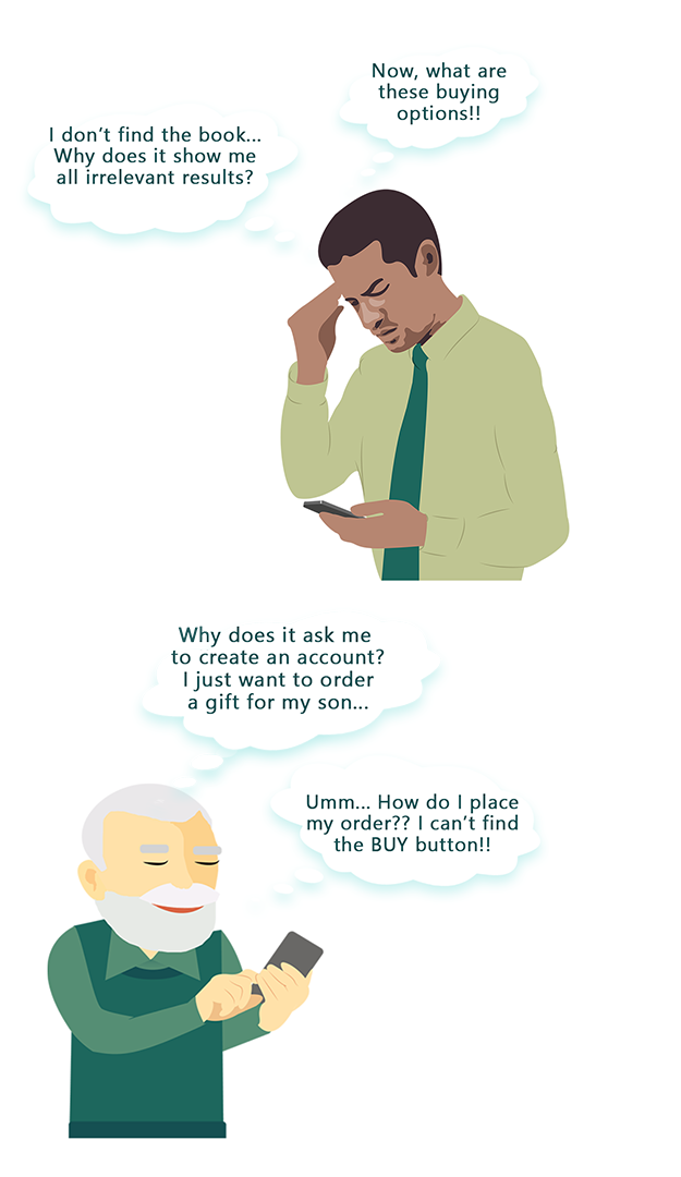
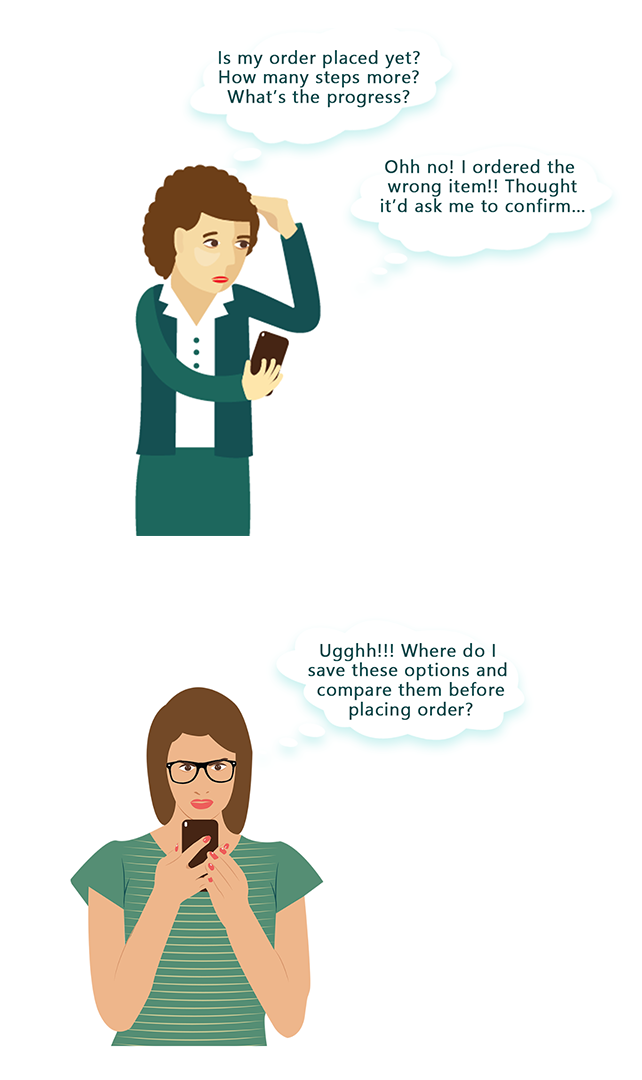
Task flow — Placing an Order
Let’s talk in detail about one flow — Placing an Order. No doubt, this is “the most” crucial flow on Amazon shopping app (focussing only on the app).
- So, a user, Jenifer, opens the app to buy, say, a pair of grey sneakers of size UK 7.
- The “Search bar” at the top is easily discoverable and it’s intuitive to just enter “Sneakers” and hit “Enter”.
- Now, the page loads and now Jenifer is overwhelmed. There are so many things all over — ads, filters at the top, side, middle of the page, then reviews and ratings of popular products midway.
- So, she wonders, let’s apply filters. Size 7. Color? Maybe, Black, Gray. And shoes that have 4 and higher ratings.
- Even after filtering, Jenifer sees a lot of “Sponsored” products that don’t match her requirement. White ones, shoes for kids and so on.
- Now she further filters by brand — Puma. After an exhaustive search, she finds one and goes to the Product Details page.
- Now, where is the “BUY” button?? Need to scroll down a bit. She clicks on “Buy Now”. Nothing happens. What’s wrong? She refreshes the page. Reopens the app. On scrolling up again, she discovers there’s a little error message lost in the clutter — “Select a size”.
- Jenifer selects UK 7 and proceeds to check out, adds her address, proceeds to the payment page. There’s a “Continue” button at the top. Now what does this do! Scrolls to find some payment methods, selects UPI, and another “Continue” button below.
- Now, what was the price? Let’s go back and find it out. And go through the same process again. Finally Jenifer succeeds in placing the order.
The scope
Considering Jenifer’s shopping experience, as well as mine over the years, the following enlist the scope for usability improvement across the mobile app.
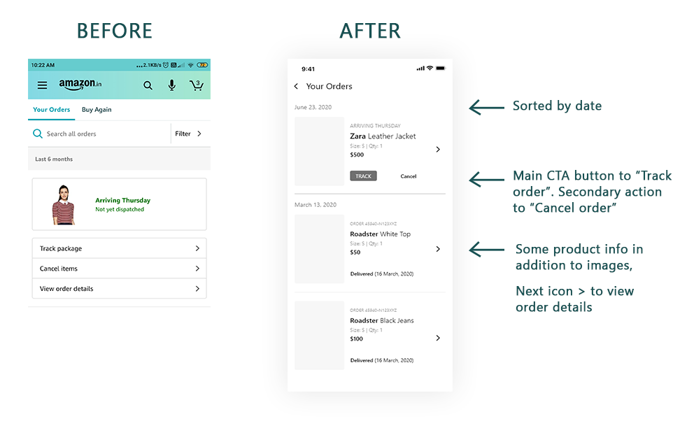
- The navigation structure is fine, only for shopping. But for tracking orders, refunds, Amazon pay and other features, it’s not as intuitive.
- Next, the overall UI is highly cluttered, and far from aesthetic — There are unnecessary ads all over. No consistency of colors, fonts, buttons.
- The visuals and the interactions seem outdated — still you can see the beveled buttons of the 90s at some places.
- The product display page is highly confusing, and opposite of intuitive.
- The hierarchy is not well planned nor tested out. It’s very difficult for a senior, non-tech-savvy user to discover important interactions like “Buy Now”, “Wishlist”, “Share”. The scroll is exhaustive.
- No clear error message.
- Difficulty to find crucial information. The top-down hierarchy is not considered while placing buttons on the screens.
- The reviews are discovered after an exhaustive search.
- The check-out experience is not trust-worthy. There are multiple points of entry for the same outcome — like “Continue” for payment. A button should only appear at the end.
- And the price details are also expected on the payment page. You can’t see any progress being made and left to guess what’s next (no progress bar).
Analysing Data from User Research
In order to analyse the data obtained from my findings by evaluating the app interfaces and the data obtained by surveying, interviewing and observing users, I used the methods of card sorting and creating User Personas. Also, in this step I had to prioritise issues according to user feedback, in order to narrow down the scope of work, because taking care of all grievances of users seemed impossible.
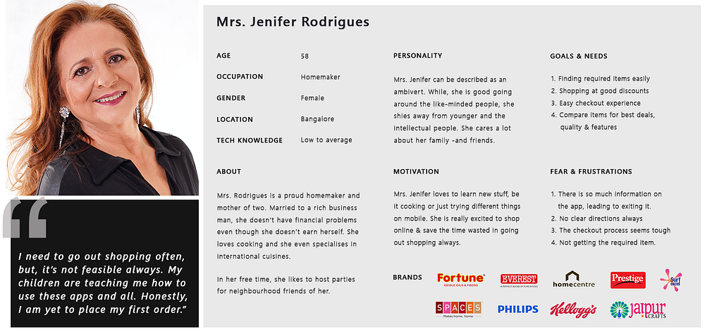
For my main objective, the user persona created is for what we define as ‘FTUE — First Time User Experience’. The amazon app, being so popular worldwide, should have better usability for a first-time user , or someone with less technical-knowledge. This would make sure that the overall usability is improved for frequent shoppers, as well.
Ideation
Initially, I thought of multiple cool ideas — after brainstorming with my professors and fellow graduates in my college. Onboarding walkthroughs, friendly AI bot, interactive tool-tips. However, I steered myself back on the track after thinking about the first-time users, especially the elderly. Well, I didn’t want to overwhelm them with cool, flashy features! I decided to stick to the basics and focus on a clean, minimal experience
Low Fidelity Prototyping
I began with sketching some of the screens, which needed to be changed. Then I proceeded to wireframing them, before jumping to high-fidelity prototyping. There were four major points I kept in mind from this stage onwards:
- To make the UI minimal
- To ensure that the look and feel is consistent throughout the app
- To simplify the checkout process
- To simplify the product search process- Avoid clutter
Wireframing
At the end of this stage, the layout was almost finalised after obtaining feedback from users of the app. The UI was monochrome, images were avoided and real icons(monochrome) were used. Check some of the wireframes below.


Let’s Compare
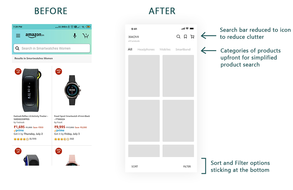
After finalising the wireframe layout of the app interface, I compared some of the earlier interfaces with those wireframes. This helped me to analyse better whether I have succeeded in improving the experience the app provides. The main reason of doing this before proceeding to the visual design stage was to ensure that I didn’t drift away my focus towards the look of the app, rather than the experience it provides.


High-fidelity Prototyping
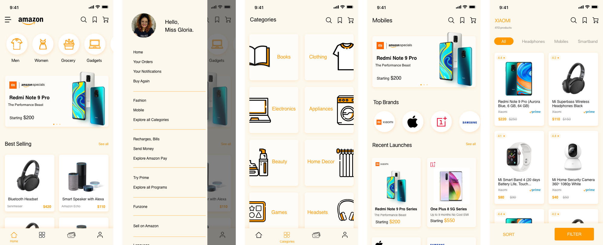
Finally this was the stage where I began working on the look of the app interface. I decided to use the colour scheme of the Amazon brand, rather than that used by the app currently (of course, when I started doing the project). The typography was also similar (not exact) to that used by the brand.
The final design was made using Adobe XD. Check out some of the app screens below.

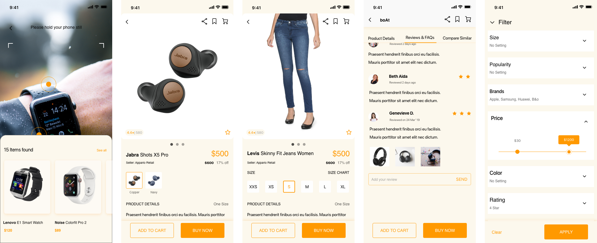


Latest updates in Amazon (Dec 2024)
Below are some of the suggested features from this old article from 2021 that has been now implemented by the brilliant team at Amazon.
- Search is a level higher on the page, reducing clutter in the header
- Sticky navigation footer
- A dedicated profile 👤 section in the sticky footer
- Filter and Sort
- Search using Camera
- Add to cart on product listing page
- Tabs for Product details, reviews
- ‘Share’ and ‘wishlist’ icons clubbed
- Delivery address confirmation before payment
But what works for Amazon?
Despite some negative experience and unpleasant aesthetics, Amazon is preferred by millions because of its secure experience. There is “easy escape and recovery from error”. If there is a payment failure, you get the money back. If you don’t want the product after ordering, you can cancel it. If you don’t like the delivered product, you can easily return it and get a refund. No personal data is compromised without your agreement. Even if it doesn’t rate high on the scale of usability, it certainly rates high on learnability, which is why it’s overwhelming for first-time users, but not for the regular buyers, who still continue to shop on Amazon.
Conclusion and Future Scope of Work
The entire journey, right from deciding to take up this project to designing final app screens was enthralling. It wasn’t easy however to reach here. First major problem was finding the right participants for the User research. Obviously I couldn’t assume myself as the user and proceed with the design. And, Amazon being a really popular app, people were acquainted with its interface and couldn’t speak much about the problems. Yet, they were like, “It doesn’t look good, it’d be better if someone redesigned it!”
Thus, I started redefining the objective of my project, to make the app easy to use for the “first-time users”. And tried my best to include older adults and the elderly in my user research. This approach finally helped me proceed forward in my project. It took almost 6 weeks for the completion of the project single-handedly.
In future, I am also looking forward to designing the dark mode UI for the app. Stay tuned. Thanks a lot for reading this far.